There needs to be a BACK BUTTON at the bottom of each thread... after last post-reply.
There needs to be a BACK BUTTON at the bottom of each thread... after last post-reply. I know people can just hit the "Back Button", or scroll back up to the bread crumbs navigation, but they shouldn't have to. (Sorry, my day job is designing/developing sites... I can't help myself with "helpful" observations.)
The Lemming
See? Nothing below. If a thread gets really long it becomes helpful to have that "Back To Forum" link there. Or, change the link "Top" to "«Back"... and use that to go back to the forum proper.
Lots of wasted space in the message body of each post too. Is that always a default size, or can those boxes be shortened, to make reading a thread a little easier? For example, there's a whole lot of space below this text before you get to the bottom of this box, that's not used. Can that be eliminated, or must every response be in this same sized box?
I'll add both concerns here to my list of eventual things.
Edited to add:
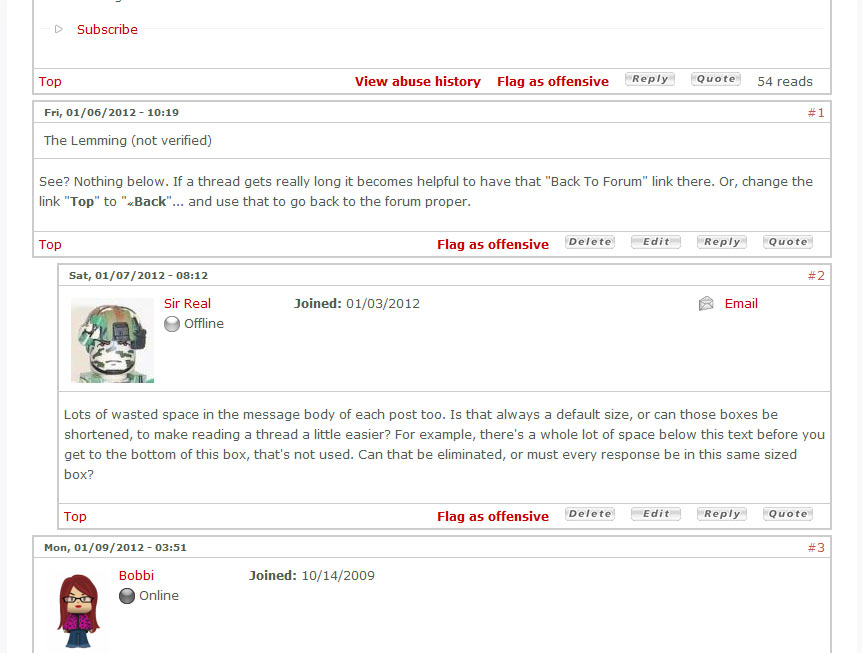
I poked around a bit, and found a few other display options for the boxes. There was another, but it was a glaring blue and I don't want to subject anyone to it. I'll post two screenshots in a reply to this post.
I think the one without the boxes could be confusing.
I kind of like the shorter boxes without the space. Let me run it past Rob to see if he remembers why we used this version instead of the one in the screenshot. There might not have been a reason, in which case, I'd be inclined to switch over to that version.


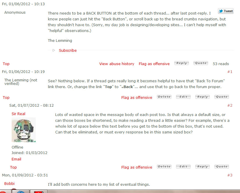
Now I see the difference... the one with the space has the user information off to the side, while the compressed version has it at the top of the post.
So then it becomes a question of which is more annoying - the empty space in each post, or the avatars and whatnot at the top.
Let's try this for a few days and see if it works out better.
The space at the bottom of the posts is gone, but the poster info is across the top of each post/reply instead of along the side.
Then again, it can't be a bad thing to kind of slow down the eye so you can make a better mental note of who is posting, right?
This seems like really funky forum software compared to what other places use. Maybe its not the tweaking but the source of the forum code?
How does this look now? It's only as big as the avatar pane now. So short posts might have a bit of white space, but it won't be as bad as it had started out.
I do prefer the avatars off to the side of the post, now that we had it the other way for a week or so.
Thats odd.. I just an email bot about a reply in this thread, but there is none.
It's up near the top, #4.
I'm also considering switching from the replies being threaded to just being added to the bottom of the thread. Each is frustrating in its own way.
I've never seen a forum where new posts are somewhere in the middle. They are always down at the bottom.
Imagine a thread with 50 replaies, and a new post somewhere around #25 or so, and trying to figure out which was the latest reply.
I've seen a number of new post emails and follwed the link, not finding the new post. This explains a lot, since I always look at the last post in the thread for new replies.


